Logic, Balance, Control: Ornament & Typography in The Dial and The Vale Press
© 2020 Alevtina Lapiy, Ryerson University.
This exhibit explores the work of Charles Ricketts as a typographer, who, frustrated with type as mechanized labour, created custom fonts with the same meticulous care he applied to his primary artistic practice: wood-engraving. After a positioning of Ricketts’s practice within the larger context of Victorian publishing, the reader can expect an introduction to Ricketts as an artist and craftsperson, an exploration of his philosophy of typography, and an analysis of the elements his ornaments and fonts share.
 Printing in 1800s Britain
Before the 1800s, typography in Britain was an “undistinguished craft”— a means and an activity, but not an art (Handover 139). The century that followed brought with immense technological advancement, in all areas of production, including printing technology. According to P.M. Handover, the The Industrial Revolution had three key impacts on printing in Britain (140). Firstly, as populations in urban areas grew, so did the possible market of readership. Secondly, as the number of goods produced by newly developed technologies rose, so did the demand for advertisement, and printing met that demand. Finally, the technological means that produced such goods impacted printing itself, imbuing the process with technologies that printed faster and in larger quantities.
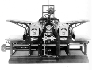
“Every year and almost every month the Victorian printer heard of new inventions,” (Handover 151), of which the most important was the first steam-powered press (see fig. 1). Friedrich Koenig and Andreas Bauer’s invention could print 1,100 impressions per hour. With improvements based on a model by Thomas Bensley, British engineers Augustus Applegate and Edward Cowper made printing by steam press even more efficient. Their four-feeder machine was later eclipsed by the vertical eight-feeder in 1848, and in 1857, that machine by one nicknamed “Lightning Press” that required twenty four people to operate and made 20,000 impressions an hour (Handover 150). A decade later, the Walter Press, a much more compact machine, replaced the “Lightning Press” in newspaper offices across Britain with an output of 12,000 eight-page copies an hour (150).
These extraordinary machines were used in newspaper offices as opposed to by book and periodical publishers, the latter of which typically printed on smaller, less powerful printers such as the Wharfedale, a stop-cylinder press (Handover 150). Periodicals had much smaller circulation numbers and so did not need such mammoths of machines. Still, the newspaper’s extraordinary outputs had reverberating effects on typography in all methods of printing throughout Britain. Handover thinks of two lines of an 1827 poem by John McCreery poem that summarize (143):
Where’er we cast our eye,
For steam and cheapness there is one dull cry.
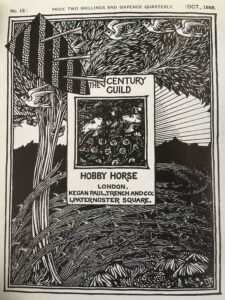
With industrial efficiency came the alienation of the craftsperson, so it is perhaps unsurprising that it is in this landscape of increasing mechanization that the The Dial and its periodical predecessors came into being. The Pre-Raphaelite Brotherhood’s The Germ, which Ricketts credited as the inspiration for The Dial (Kooistra, General Introduction) originated the model that other little magazines throughout the century would follow, joining literature and art in its pages (Martin 75). In “The Century Guild Hobby Horse: Crafting Generic Networks in Fin-de-Siècle England,” Rebecca N. Mitchell writes that The Century Guild’s Century Guild Hobby Horse (CGHH) took on The Germ’s model, paving the way for other little magazines of the 1890s. The Guild’s focus on exclusivity and craftsmanship in the face of expansion and mass production appealed to Charles Ricketts and his partner Charles Shannon, who were not only inspired by the CGHH but also enlisted editor Herbert Horne’s help at crucial points of publishing The Dial and exchanged ideas on materials and processes (Mitchell 91).
CGHH embodied certain principles that Emery Walker would later emphasize in his influential lecture on fine printing at the Arts and Crafts exhibition of 1888, such as the importance of large margins (Mitchell 99). It was this very lecture that inspired the creation of both the Kelmscott and the Vale presses (Kooistra, General Introduction).
Morris and Ricketts shared a disdain for cheap printing and sought to revive fine print making practices of past ages (Mitchell 257). In Morris’s work, Ricketts saw the craft and beauty that he thought missing in modern type, writing in “William Morris and His Influence on the Arts and Crafts” that it is Morris’s work with the Kelmscott Press that marked the “initial effort” in the Revival of Fine Printing in Britain.
 Charles Ricketts
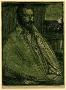
Charles de Sousy Ricketts devoted his life to art. In his youth, his frequent travels across France and Italy shaped his aesthetic taste. Visits to museums and galleries familiarized him early on with the “canons of European art,” a knowledge he brought with him to the City and Guilds Technical Art School, where he trained a wood-engraver (Frankel). In the previous three decades, woodcutting was a lucrative and respected profession, but one that concerned itself primarily with mechanical reproduction (Frankel). Ricketts sought to bring the artist and the engraver together, choosing to approach wood-engraving as a method of original production. Though his primary art and craft was wood engraving, Ricketts worked in a variety of other mediums throughout his life, including costume design, writing, and, of course, typography design. Ricketts became a typographer through his two publishing ventures: The Dial and his fine printing press, The Vale Press.
 The Dial
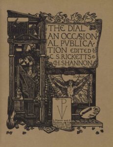
In “The Little Magazine as a Periodical Portfolio: the Dial, the Pagan Review and the Page,” Koenraad Claes writes that both the Pre-Raphaelites and the “Artistic Craftsmen” prioritized “the material aspects of the work of art (74), and The Dial‘s volumes reflect a commitment to the same.
The Dial was typeset in an old-style typeface similar to the Caslon, and when more detail was desired, the text was engraved, such as on the covers and title pages (Claes 75). The Dial’s first volume used photomechanical reproduction on coated paper — a process Ricketts was dissatisfied with (Kooistra, General Introduction). For Volumes 2–5, The Dial’s printing moved to the Ballantyne Press, and laid paper replaced the coated to ensure even inking and allow the text to stand out on the page (Kooistra, Critical Introduction to Volume 2). From Volume 2 onwards, Ricketts opted for designing and engraving all ornaments and some illustrations himself, highlighting a medium in which the artist and craftsperson are one. In addition to its influence on other little magazines of the 1890s, The Dial can be viewed as an apprenticeship in the skills necessary for the forming of the Vale Press — printing, engraving, page layout, and typography (Kooistra, General Introduction).
The Vale Press
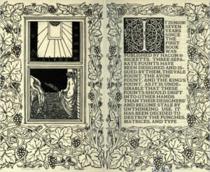
Between The Dial’s third and fourth volume, Ricketts established the Vale Press with Llewellyn Hacon. For the Vale Press books, Ricketts designed and engraved both the ornament and the typography himself. Engraving the fonts alone took him a year’s time (Kooistra, Critical Introduction to Volume 4). Just as the Kelmscott Press, the Vale Press formed in response to Walker’s influential 1888 lecture on fine printing. A Kelmscott and a Vale Press book, writes Ricketts in A Bibliography of the Books Issues by Hacon & Ricketts, “is a living and corporate whole … it is concerned harmoniously with and made beautifully like any other genuine work of art” (vii). A work of art, Ricketts believed, is a “whole in which each portion is exquisite in itself yet coordinate” (vii). Each component of each Vale Press book was meticulously designed, including the fonts. For the Vale Press, Ricketts created three of them: the Vale, the Avon, and the King’s. Although it had but a short run of eight years, the Vale Press significantly impacted small presses for years to come (Kooistra, Critical Introduction to Volume 4). In 1930, A. J.A. Symons claimed that the modern typographer and graphic designer originated with Ricketts (Kooistra, Critical Introduction to Volume 4).
Ricketts’s Philosophy of Typography
For Ricketts, excellent typography was about logic, balance, and control. In Of Typography and the Harmony of the Printed Page, he claims that there is a fundamental link between the art of page-arrangement and typography. When comparing the “classic simplicity” of setting up the page with the “ugliness and dullness of contemporary printing,” he writes, meticulous attention to the page may look archaic (197). So, too, he continues, might attention to the letters on said page — any attempt to understand its forms, refine those forms through engraving, and through that engraving process, show “the influence of formative processes” (197). Yet this attention, to both page and type, is the pathway to beauty. For Ricketts, it is only through understanding the forms of letters that typography becomes harmonious (198).
For Ricketts, the engraver’s tool achieves what other means cannot. In A Defence of the Revival of Fine Printing, he writes lovingly of the early elements of typography design: “Once in type each fault tells and is repeated over and over again; your stops, dots, accents must no longer be blurs; once shaped by the punch-cutter they must be shapes, diamonds, wedges; revised by the punch-cutter the curved terminations of the letters are no longer smears, they must show the shaping of the tool in the making of them, and so gain an added definiteness and beauty” (7–8). It is through the control the engraver has over their material that definiteness is achieved, and it is through the showing of the engraving process that beauty is.
Ricketts locates the biggest obstacle to good type in the “economy of space” — that temptation that pulls the printer to cram the page with letters, closer and closer to one another, in order to save on printing costs (9). No, Ricketts firmly held that letters need space to be seen, that type ought to be “bold and legible (34). It is by “fulness, roundness, and boldness” that good type is characterized (9). Through deliberate design and placement, Ricketts writes, letters may be “recast by the light of reason, and with due regard for beauty and proportion” as with the best typographical efforts of the past (Ricketts, A Bibliography xii).
Ricketts called for a revival of fine printing, the aim of which he saw as “a wish to gain a permanent and beautiful form to that portion of our literature that is secure of permanence,” and by permanence he meant not merely the inking of the page as a material thing, but “permanent in the sense that the work reflects that conscious aim towards beauty and order” (Ricketts, A Bibliography xvi). This aim can be seen as the reaching for the eternal, a search in Modernity’s transience, fleetingness, and contingency, for something immovable (Baudelaire 7). Thus, for Ricketts, typography is an element of a harmonious whole: part of a delicate balance, logically and carefully crafted as means of reaching for beauty, for the eternal.
Ornament and Type
In A Defense of the Revival of Printing, Ricketts writes that line processing cannot obtain the delicate curves that wood-engraving can. There’s a “warmth” to wood-engraving: the creation of lines to be preserved in their entirety, with curves to be “knelt” or “welded” (32). Like type, Ricketts writes, the engraving design benefits from meeting with the wood, “the material for which it is designed,” becoming a stamp “as if it were like the page of type itself” (32). In this statement, Ricketts reveals the fundamental similarity for him, between wood-engraving and typography: it is through an emphasis on the design and the carrying out of that design with precision and careful attention to the medium that excellence is reached in both. This section of the exhibit explores the link between ornament and type, arguing that the fluid lines and bold strokes that make up Ricketts’s ornaments for The Dial‘s second volume can be seen, too, in the fonts he designed for The Vale Press.
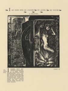
“My Hair is Filled with Drops of the Night” (see fig. 7) is signed in more ways than one. If one looks closely, they’ll see that the figure of the man curves into the letter “C,” and of the woman into an “R,” with her body contorting to meet the shape, torso twisted to turn the right knee to the side and up, the left elbow to lift and meet the head, the right elbow to move down and out, and the wrist to curve unnaturally first to the waist and then away at the fingers. Together, the man and woman form the shape that matches Ricketts’s signature in the bottom left corner of the image. As the eye wanders, other letters appear: four Is in the lattice behind the couple (lattice planks that could also conceivably form Fs and Es), a lower-cased “b” at the handle of the door, an “s” repeated in the vines that curl around the lattice. (Special thanks to Christina Anto, who spotted the “I” in “My Hair is Filled with Drops of Night” and sparked my analysis of this image.)
More and more letters pop up as one searches, so much so that it feels like reading too deeply into the shape of a leaf or the curve of an elbow. Yet that may be precisely the point — Ricketts encourages this reading by forming so obviously his initials into the two figures that he tempts the viewer to search for other letters. In presenting the illustration this way, Ricketts calls attention to what letters really are: collections of lines and shapes, or, in other words, forms.
Katherine Brideau argues for an understanding of typography in terms of form in Book Typography and the Challenge to Linear Thought. Typography, she writes, is a strange medium: it is a mode of linguistic representation, but it is “not itself a representation of language.” Rather, it is a visualization — a visualization that simultaneously aims at invisibility. Typography’s function as a carrier of linguistic meaning is a “cloaking device”: it is when we read typography that we least see it (Brideau 120). “In spite of its materiality,” Brideau writes, “typography, like a window, is most often looked through rather than at” (119). This exhibit aims to draw attention to typography not as something to read, but as something to consider and to see. To see typography in this way is to recognize it as marks on the page that exist outside of the linguistic expressions that combinations of such marks express, to think of it as, in Brideau’s words, “interacting shapes” (235). Brideau’s framework is useful in analyzing the three fonts Ricketts created for the Vale Press.
The Vale
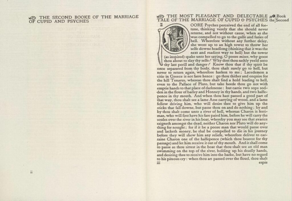
The first font Ricketts designed and the one he presented as part of the Arts contents of The Dial’s fourth volume, forms the basis of the three. It is balanced, the shapes evenly distributed and sitting at the same height unless indicating a change of sentence. The serifs sit atop as if small leaves. The Vale is bold and vibrant; just like all of Ricketts’s engravings, it is etched in with meticulous care. Each letter has been evidently considered. As opposed to simply inverting the “n” to make a “u,” the “u” has its own, distinct shape. Combinations of shapes have also been considered. When lower-cased “e” meets lower-cased “y,” becoming “ey,” for instance, the slant of the “e” crossbar falls in angled harmony with the tail of the “y.”
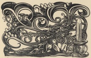
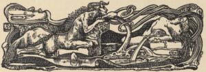
The Vale’s letters are smooth, with the exception of “W,” “T,” and “I,” and in these, sharpness is emphasized, just as it is in “My Hair is Filled with Drops of the Night” (see fig. 7), in which the straight rays of the lantern and the 90° angle of the wooden beams contrast the curved figures. The Os, Cs, Ds, and Gs of the Vale consist of satisfying curves that the eye picks up in “The Unwritten Book” (see fig. 9) and “Maurice de Guérin” (see fig. 8) headpieces. Every line on the “Maurice de Guerin” is a curved line, and every stroke is bold. “The Unwritten Book” headpiece’s curved lines swirl like those of the lower-case “b” and “d” of the Vale. The vertical lines on the Vale “b” and “d” are rounded, reminiscent of the ladle-like shape at the entrance of “My Hair is Filled with Drops of the Night” (see fig. 7).
The Avon
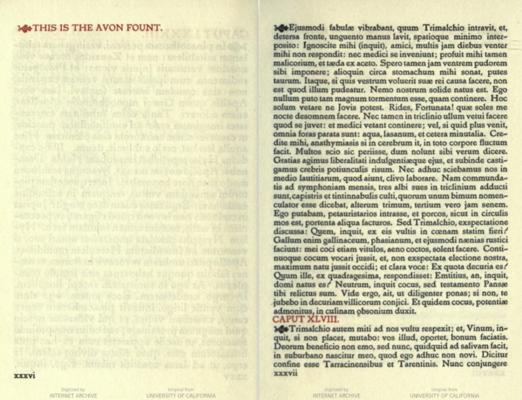
The Vale Press’s second font is lighter in body, with a greater contrast between thick and thin strokes. The serifs are smaller, and there is a tilt: the letter “o” and all of the loop forms angle ever so slightly. For the books published in Avon, Ricketts kept the decoration minimal and opted for a thinner paper to suit the more delicate font (Ricketts, A Bibliography xxxiii). Some letters, like the “Q” gain longer tails that ornament the page, and some letters conjoin, like the “a” and the “e.” In comparison to the Vale, Avon is tighter and thinner. Though present in the Vale, Ricketts’s interrogation mark (the one that appears as if an exclamation point tentatively considering becoming a question mark), is perhaps most harmonious in the Avon, falling satisfyingly in line with the curves and angles of the this thinner font.
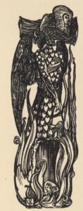
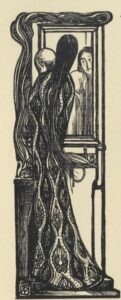
The whisper of strokes that form into the Avon can be seen in “The Bridal, Ella the She-Bear” and “The Marred Face” ornaments (see fig. 11 and fig. 12). The oval face of the figure in “The Marred Face” forms into an Avon-like “o,” and the “”The Bridal,” “Ella the She-Bear,” “Snow in Spring” shape is engulfed from the bottom up in flame-like wisps that so resemble Avon’s “Q” tail. In both pieces, the figures are elongated, seemingly stretching up towards the top of the page, as in “”The Bridal,” “Ella the She-Bear,” “Snow in Spring”,” and down towards the bottom of it in “The Marred Face.” An ever-so slight curve in both figures marks the tilt that the eye spots in the Avon font, and though thin, the strokes remain vibrant.
The King’s

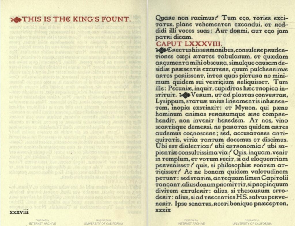
Ricketts’s final font for the Vale Press is the one he was most fond of, writing of it in A Bibliography the Books Issued by Hacon & Ricketts as if of the beloved youngest child (xiv). The King’s is the most experimental of the three. It shares with the Vale and Avon the characteristic boldness, control, and balance, but the letters deviate from their expected form. The capital “R” replaces the lower-case “r,” and the “e,” in both the upper-case and lower-case variants, returns to the Roman form. There is a starker contrast between the thick and thin lines than in both the Vale and the Avon. This contrast can be seen most clearly in the upper-case “A. The capital letters are taller than in the Avon and the Vale, as well as noticeably taller than the lower-case letters that follow them in sentences. The spines on the lower-case “l,” “b,” and “d” have elongated, too. Somehow, in all this contrast, the balance remains.
The rounded elements balance the seeming irregularities of the font, just like the shapes that form the “King Comfort” headpiece (see fig. x). The middle peacock’s head, a sharp threat to the harmony of the page, is counterbalanced by the elements to its right and left: the peacock tails unfolding around the two feminine figures at each corner that fill the horizontal space, like the wide-set forms that make up the King’s font.
In The Grammar of Ornament, Owen Jones sets out 37 general principles for form and colour in the decorative arts. Three of these are especially prominent in Ricketts’s wood-engravings: Prepositions 3, 6, and 10 (Jones 4).
Preposition 3: As Architecture, so all works of the Decorative Arts; should possess fitness, proportion, harmony, the result of which is repose.
Preposition 6: Beauty of form is produced by the lines growing out one front he other in gradual undulations; there are no excrescences; nothing could be removed and leave the design equally good or better.
Preposition 10: Harmony of form consists in the proper balancing, and contrast of, the straight, the inclined, and the curved.
The same principles can be found, too, in Ricketts’s fonts. In his creation of both ornament and typography, Ricketts sought purposefulness through the logical arrangement of forms, harmony through the balance of the page, and beauty through control of his medium.
Works Cited
Baudelaire, Charles. “The Painter of Modern Life,” The Painter of Modern Life and Other Essays. Translated and edited by Jonathan Mayne. Phaidon Press, 1995, pp. 5–15. Ryerson Library E-Reserves, https://reserve.library.ryerson.ca/ares/ares.dll?SessionID=W071115730A&Action=10&Type=10&Value=333822.
Brideau, Katherine C. Book Typography and the Challenge to Linear Thought. 2013. New York University, Ann Arbor, PhD dissertation. ProQuest, http://ezproxy.lib.ryerson.ca/login?url=https://www-proquest-com.ezproxy.lib.ryerson.ca/dissertations-theses/book-typography-challenge-linear-thought/docview/1417775749/se-2?accountid=13631.
Claes, Koenraad. “The Little Magazine as a Periodical Portfolio: the Dial, the Pagan Review and the Page,” The Late-Victorian Little Magazine. Edinburgh University Press, Edinburgh, 2017, pp. 64–82. ProQuest Ebook Central, https://ebookcentral-proquest-com.ezproxy.lib.ryerson.ca/lib/ryerson/detail.action?docID=5454643.
Frankel, Nicholas. “Charles de Sousy Ricketts (1866-1931),” Y90s Biographies, 2010. Yellow Nineties 2.0, edited by Lorraine Janzen Kooistra, Ryerson University Centre for Digital Humanities, 2019, https://1890s.ca/ricketts_bio/.
Handover, P. M. “British Book Typography.” Book Typography 1815–1965 in Europe and the United States, edited by Kenneth Day, University of Chicago Press, 1966, pp. 137–174.
Jones, Owen. The Grammar of Ornament. Day and Son, 1856. Smithsonian Libraries, https://dx.doi.org/https://doi.org/10.5479/sil.387695.39088012147732.
Kooistra, Lorraine Janzen. “General Introduction: The Dial: An Occasional Publication (1889–1897)” The Dial Digital Edition, Yellow Nineties 2.0, edited by Lorraine Janzen Kooistra, Ryerson University Centre for Digital Humanities, 2019, https://1890s.ca/dial_introduction/.
Kooistra, Lorraine Janzen. “Critical Introduction to Volume 2 of The Dial (1892)” The Dial Digital Edition, Yellow Nineties 2.0, edited by Lorraine Janzen Kooistra, Ryerson University Centre for Digital Humanities, 2019, https://1890s.ca/dialv2_critical_introduction/.
Kooistra, Lorraine Janzen. “Critical Introduction to Volume 4 of The Dial (1896)” The Dial Digital Edition, Yellow Nineties 2.0, 2019–2020, edited by Lorraine Janzen Kooistra, Ryerson University Centre for Digital Humanities, 2020, https://1890s.ca/dialv4_critical_introduction/.
Mitchell, Rebecca N. “The Century Guild Hobby Horse: Crafting Generic Networks in Fin-De Siècle England.” The Papers of the Bibliographical Society of America, vol. 112, no. 1, 2018, pp. 75–104. The University of Chicago Press Journals, https://www-journals-uchicago-edu.ezproxy.lib.ryerson.ca/doi/10.1086/696259.
Ricketts, Charles. A Bibliography of the Books Issued by Hacon & Ricketts. The Vale Press, 1904. HathiTrust Digital Library, https://hdl.handle.net/2027/uc2.ark:/13960/t5z60fz0v.
Ricketts, Charles. A Defence of the Revival of Printing. The Vale Press, 1899. HathiTrust Digital Library, https://hdl.handle.net/2027/uiug.30112048330622.
Ricketts, Charles. “King Comfort,” Y90s Database of Ornament, http://ornament.library.ryerson.ca/items/show/160.
Ricketts, Charles. “Maurice de Guérin.” Y90s Database of Ornament, http://ornament.library.ryerson.ca/items/show/161.
Ricketts, Charles. “My Hair is Filled with Drops of the Night.” The Dial, vol. 2, 1892, AE. Dial Digital Edition, The Yellow Nineties 2.0, 2019-2020, edited by Lorraine Janzen Kooistra, Ryerson University Centre for Digital Humanities, 2019. https://1890s.ca/dialv2-ricketts-hair-ae/.
Ricketts, Charles. “On Typography and the Harmony of the Printed Page: Translated from the French of Charles Ricketts.” Translated by Richard K. Kellenberger. Colby Library Quarterly, vol. 12, 1953, pp. 194–200. ProQuest, http://ezproxy.lib.ryerson.ca/login?url=https://www-proquest-com.ezproxy.lib.ryerson.ca/scholarly-journals/typography-harmony-printed-page/docview/1290117619/se-2?accountid=13631.
Ricketts, Charles. ““The Bridal,” “Ella the She-Bear,” “Snow in Spring”,” Y90s Database of Ornament, http://ornament.library.ryerson.ca/items/show/162.
Ricketts, Charles, “The Marred Face,” Y90s Database of Ornament, http://ornament.library.ryerson.ca/items/show/159.
Ricketts, Charles. “The Unwritten Book,” Y90s Database of Ornament, http://ornament.library.ryerson.ca/items/show/158.
Ricketts, Charles. “Two Pages of the Vale Type.” The Dial, vol. 4, 1896. Dial Digital Edition, Yellow Nineties 2.0, 2019–2020, edited by Lorraine Janzen Kooistra, Ryerson University Centre for Digital Humanities, 2020. https://1890s.ca/dialv4-ricketts-vale-type-AG/.
Ricketts, Charles. “William Morris and His Influence on the Arts and Crafts: Translated from the French of Charles Ricketts.” Translated by Richard K. Kellenberger. Colby Library Quarterly, vol. 5, 1952, pp. 69–75. ProQuest, http://ezproxy.lib.ryerson.ca/login?url=https://www-proquest-com.ezproxy.lib.ryerson.ca/scholarly-journals/william-morris-his-influence-on-arts-crafts/docview/1290116975/se-2?accountid=13631.
Wager, Anna. “Photographs, Pens, and Print: William Morris and the Technologies of Typography.” Book History, vol. 21, no. 1, 2018, pp. 245–277. Project MUSE, https://muse-jhu-edu.ezproxy.lib.ryerson.ca/article/711055.
Images in this online exhibit are either in the public domain or are being used under fair dealing for research purposes, private study, or education.
