Launching Yellow Nineties 2.0
A SYMPOSIUM & CELEBRATION
❦ Y90s Research Creation
The late-Victorian little magazines remediated on Yellow Nineties 2.0 were designed by their makers to be beautiful printed objects. Contemporary artists, researchers, and students have been inspired by Y90s magazines to create research objects in other media, including artisanal books and textile art.
Elements of Ruskin: A Deformance in Three Acts (2014)
Artist’s Statement: Unable to attend the Digital Humanities Summer Institute in Victoria in 2014, book artist and Y90s project manager Reg Beatty conceived a “short and sweet” project at TMU’s Centre for Digital Humanities, timed to coincide roughly with DHSI, and invited Lorraine Janzen Kooistra to join him in a digital exploration of image and text at the CDH, June 2-6. We started with a selection of text from John Ruskin’s The Elements of Drawing in Three Letters to Beginners (1857) as well as images from his digitized teaching collection at the Ashmolean. Then, with Jerome McGann’s notion of deformance firmly in mind, we proceeded to “combine” the texts and images by means of an algorithmic manipulation, playing with code written by Generative Gestaltung and run through Processing, the open source prototyping software. This allowed us to draw with words— or perhaps rather, write with pictures. The resulting book. Elements of Ruskin: A Deformance in Three Acts, pairs some of these deformations with excerpts from The Elements of Drawing.
The types are Goudy Sans, designed in 1930 by Frederic Goudy (its own delicate deformation of American Arts and Crafts and commercial publishing desires) and Cabin Sketch by the Argentinian type designer Pablo Impallari (a variant of his humanist sans Cabin but with the “texture of a teenage doodle”). The papers are Moab Entrada Rag Natural, Canson Mi-Teintes endpapers, and glassine wrappers. Two copies of the book were printed with archival inks on an Epson R2880 and bound by hand.
The Flipbook at Archive.org
A Riot of Type (2019)
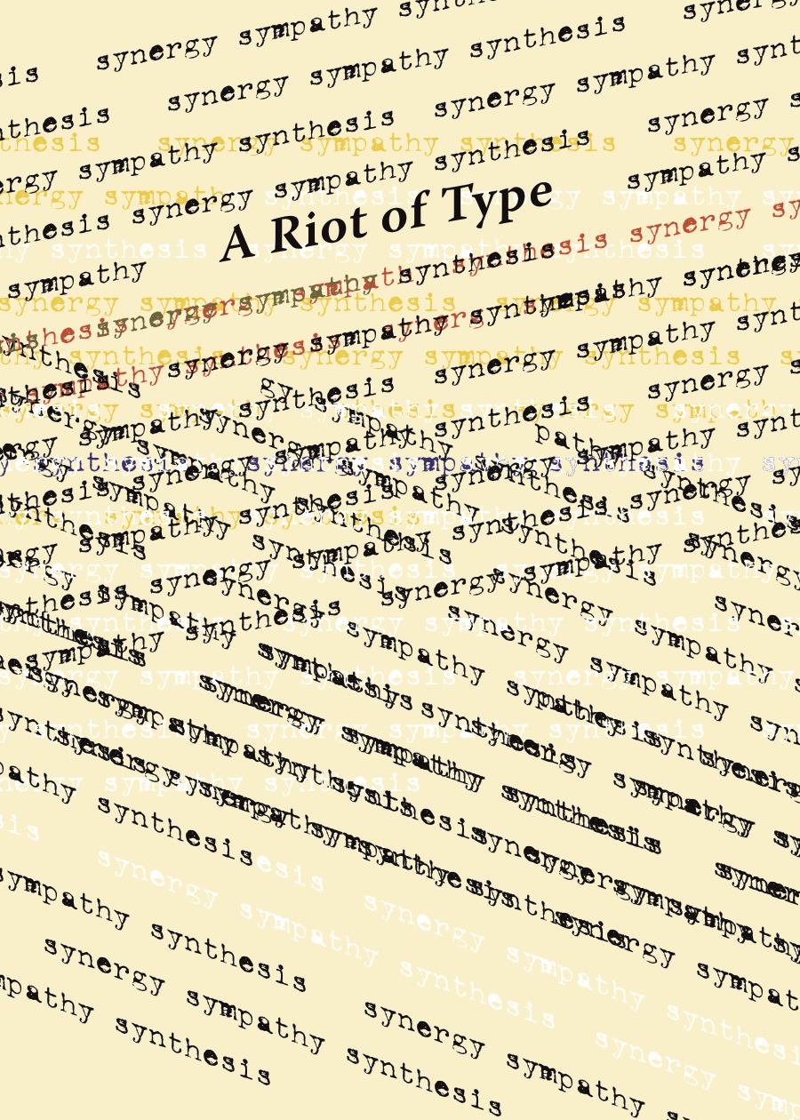
Artist’s Statement: A Riot of Type was conceived in summer 2019 by book artist and Y90s project manager Reg Beatty as a creative response to encoding the Evergreen Digital Edition for Yellow Nineties 2.0. He invited three members of the Y90s research team—undergraduate RA Emma Fraschetti, graduate RA Rebecca Martin, and PI Lorraine Janzen Kooistra—to select one of The Evergreen’s seasonal volumes and perform the following tasks:
- Find 2 quotations (can also be part of a poem etc.) from the Evergreen Seasonal Volume that they are working from.
- Choose up to 3 ornaments from the same Volume. (a detail of one to be used in the book)
- Choose 2 more short word clusters (3 – 7 words) from the Volume’s essay on “The Biology” of the season (to form the basis of a typographic ornament).
- Choose two or three quotes from Tom Phillips’ Treatise on the Nature of Ornament.
- Choose 2 patterns from Zuzana Licko’s Hypnopaedia font that appeal to you.
Working with the selections chosen for Spring (Rebecca Martin), Summer (Reg Beatty), Autumn (Emma Fraschetti), and Winter (Lorraine Janzen Kooistra), Beatty created A Riot of Type as a materially produced digital book inspired by The Evergreen: A Northern Seasonal (1895-96).
Beatty, Martin, and Janzen Kooistra presented A Riot of Type at the British Association of Victorian Studies in Dundee, Scotland, in August 2019.
The papers are Moab Entrada Rag Natural, Canson Mi-Teintes endpapers, and glassine wrappers. One copy of the book was printed with archival inks on an Epson R2880 and bound by hand.
The Flipbook at Archive.org
The Yellow Art Piece (2023)
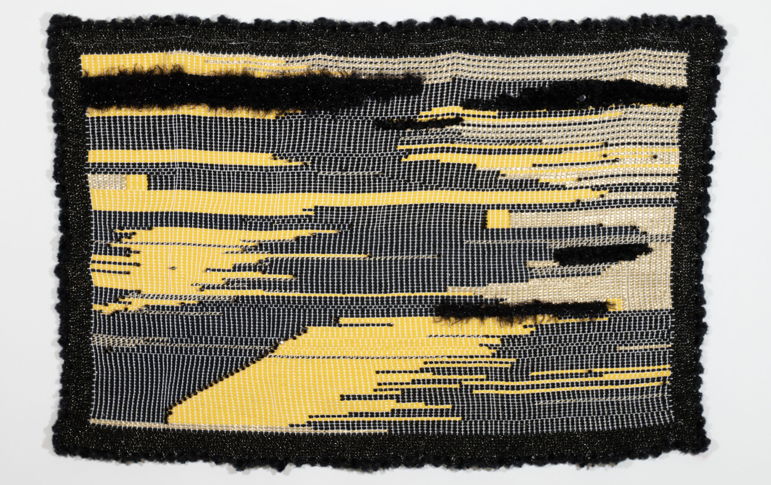
Azadeh Monzavi’s Artist’s Statement: The Yellow Art Piece was explicitly created for the Autumn 2023 issue of Volupté: Interdisciplinary Journal of Decadence Studies, guest edited by Dr. Robyne Calvert and Dr. Veronica Isaac. The inspiration for this piece came from a graduate seminar taught by Lorraine Janzen Kooistra and Alison Hedley, Little Magazines and/as New Media, which introduced me to Yellow Nineties 2.0 (Spring/Summer 2020). Thus, I returned to the Yellow Book Digital Edition when tasked with creating a work decadently meant to be art for art’s sake.
The description provided below is taken from the published article found here.
In theory, as an artist whose practice is centred around contemporary issues of identity, feminism, social justice, and memory, I approached this work with one inspiration: art for art’s sake! It was meant to be aesthetically pleasing, luxurious for its use of materials, and decadently self-indulgent. In practice, however, it was an embodied experience of the decadent pain one feels in the pleasure of creating something beautiful yet of no use.
Materials that I had initially been drawn to, such as rich velvets, heavy brocades, and delicate lace, proved useless as they fell apart. The suitable yellow fabric to use also proved impossible to find on the shelves and baskets of charity shops. After a few failed options, finding the right shade of yellow fabric that could be cut into ribbons without falling apart became an occupation of mine. On the surface, the seemingly abundant use of materials without the added value of morals turned out to be a valuable lesson in materiality. Most importantly, given that the materials are upcycled, they are inherently embedded with narratives—purposes and intentions. Whether leftover from a dress made by mum, a quilt by grandma, or simply a sewing project abandoned halfway, these materials add their history to the piece. The resulting artwork is the most decadent work I have created to date, a work whose every inch has received equal attention and effort.


